I’ve been working recently on different visualizations of the geolocation information I’ve discussed on a couple of previous occasions. (See posts on the corpus, on method and accuracy, and on an earlier style of mapping.)
Here’s the latest: Below are Google Fusion Tables intensity maps of the distribution of named places in my corpus (1098 volumes of U.S. fiction dating from 1851-75; good but not final data, so don’t get carried away just yet), aggregated by nation and by U.S. state.

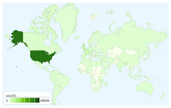
Named locations aggregated by nation, linear density scale.
(WordPress.com doesn’t allow embedded iframes; click on this (or any) map to see the live version, which includes raw counts per territory on mouseover.)
This first figure mostly shows that the large majority of named places in books written around the Civil War are located in the United States. But (a.) there’s a fair amount of international distribution and (b.) there’s more variation in that international distribution than the shading here reveals. (FWIW, the distribution looks power-law-like, but I haven’t checked yet.)
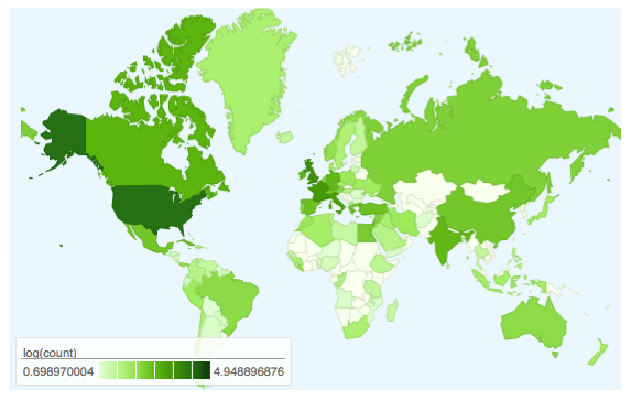
For better comparative resolution, we can use log-scaled density shading. Note that this of course flattens the difference between high and low densities, which is why I’ve included both figures.

Named locations aggregated by nation, log density scale.
Click for live version.
The log scale brings out a bit better the comparatively high concentrations of named places in western Europe, the Middle East, Russia (who knew?), China, India, Canada, Mexico, Brazil, and Australia. (If I’m remembering right, Greenland is all Melville. But don’t quote me on that.)
What about the distribution within the United States? Ask and ye shall receive:

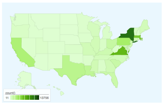
Named locations aggregated by state, linear density scale.
Click for live version.
New York, Virginia, and Massachusetts stand out; PA, CA, TX, and LA also have pretty decent numbers. A lot of flattening in this visualization, though, so …
The log version:

Named locations aggregated by state, log density scale.
Click for live version.
Interesting how this shows more clearly the notable density in the south and midwest.
More to come, especially time-resolved series (which should be really useful) and city/POI-level maps.
Two notes in passing:
1. Fusion Tables (the tool) and fusion tables (the output) are really cool. They’re dead simple; the charts here took about 15 minutes to create once I’d dumped the relevant data from MySQL. Great for testing and prototyping. But there are limits on what they can do and they’re not terribly flexible outside the things they’re built to do. I had to generate the log counts in Excel, for instance, because you can’t perform computations on aggregated data. (The aggregation itself was totally painless, though, as was the export-import.)
2. I’ll probably need a different package for the city-level mapping, because fusion tables intensity maps will only show 250 data points at a time. Even in my reduced and cleaned data, I have about 1700 unique locations. Also thinking about exactly how to represent both number of instances (marker size, I think) and time-evolution (maybe something like the Outbreak-style Walmart map from FlowingData, though I’d like for my sanity to avoid Flash.)
[Update: It would obviously also be interesting to compare these densities–and their evolution over time–to census data from the period. This is In The Works.]

One thought on “Density of Locations in U.S. Fiction around the Civil War”