
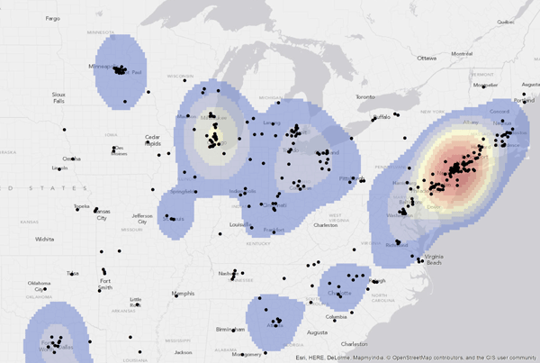
I’ve been thinking recently about how to visualize the distribution of geographic attention. There are a bunch of ways to do this, of course, no one of which is categorically correct. It depends on what you’re trying to capture. But a typical approach for me has been to use a bubblemap with marker areas corresponding to the number of times a specific location is mentioned in a collection of texts. A couple of examples:


Since the markers are transparent, you get a sense of the density as the fill color builds toward fully opaque.
There are other ways you might try to capture aspects of this problem. Heatmaps are an obvious idea, something like this cool (but sadly defunct?) map of world “touristy-ness” based on geotagged photos:
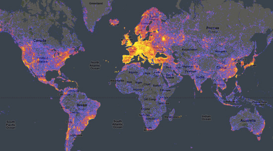
One thing that’s tricky about heatmaps is that, by convention, dark areas represent low values and light areas represent high values. That works well when layered over dark basemaps (as above), but less well over light ones:
The dark edges suggest a stark boundary where in fact there is none. And I really want to use light basemaps, since dark ones reproduce poorly in print.
Anyway, you can fight convention, of course, and use a light-to-dark colormap. I’ll show a version of that approach below. But I also came across a great post from Agile Scientific that discussed two other methods: contour lines and hillshading, both familiar to anyone who has used a topographic map. Here’s Agile’s result, showing the seabed off Nova Scotia:
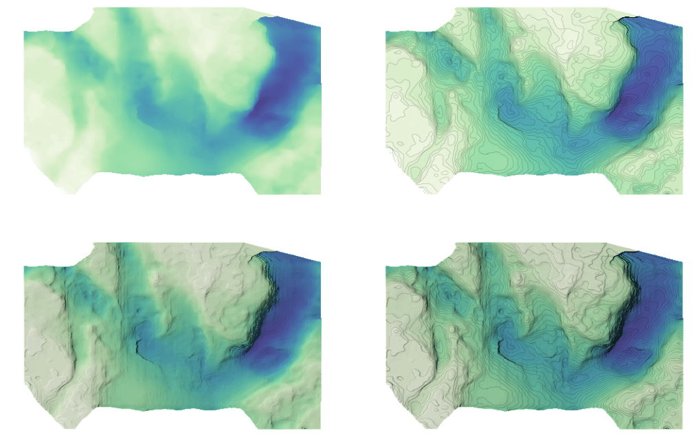
Neat! OK, so how would it look with the London data from the very first map above? Here are a few possibilities:

Clockwise from top left: bubblemap, heatmap, heatmap with contour lines and hillshading, and bubblemap with contour lines (but no hillshading).
These visualizations emphasize different aspects of the data. The bubblemaps are good for identifying the specific locations in question. The heatmap alone highlights areas of highest density. The hillshaded map reminds me of the Z-Axis project, though tuned to be less “peaky” — which the Z-Axis tool also allows — and without the tricky basemap transformation.
I maybe like the bubblemap-with-contours version best, since it allows you to see the specific locations and a representative density distribution at the same time. But I have to admit that, despite having spent a couple of days playing with this, I’m not finally convinced that I’ve found something broadly better for my purposes than the bubblemap with which I began. I worry in particular about mixing cartographic conventions; most people probably won’t be confused about London, but what about those who don’t know that city? Or somewhere less familiar? Do the contours add enough interpretive value to be worth the need to overcome their association with physical elevation? I suppose the answer depends on context.
In any case, this was a fun exercise. There’s code and sample data available on GitHub if you want to try it yourself or see how the maps were made. FWIW, these images depend on the standard Python data science stack (via Anaconda, in my case), plus the cartopy package for mapping operations and Mapbox tiles for the basemap. It would be interesting to translate the output format into something interactive, probably in Leaflet via Folium or something, which I’ve used in the past. A task for another day, though I’d be grateful to know how others deal with dual output intents. I’ve prioritized print with the static maps here, but it would be nice to flip a switch and get both.
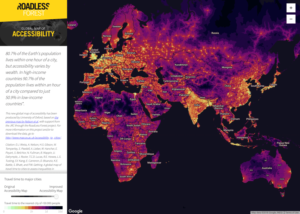
Update: Speaking of good uses of heatmaps, have a look at Oxford’s RoadLess Forest project “global map of accessibility.” Shows travel times to the nearest city with a population over 50,000. Cool, pretty, interactive, and analytically useful.

Fascinating!