I’ve come up with a visualization of data uncertainty that seems really obviously useful, but that I’ve never seen before. So I guess some combination of three things must be true:
- I am a genius. Deeply unlikely, given that I misspelled “genius” the first time I typed it here.
- There’s something wrong with the “new” method that makes it less useful than I think and/or total bunk.
- People do use this, and I just haven’t seen it before. Totally possible, given the number of statistical visualizations in most literary studies papers.
Anyway, the idea is to use probability clouds to show a density region around a given line of best fit through the data.[1] I think this avoids some visual-rhetorical pitfalls in the usual ways of showing trends and uncertainty in data, but/and I’d be grateful for thoughts on its value.
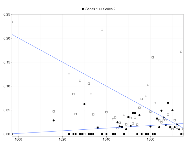
Here’s the context and an example: I’m working on a manuscript at the moment for which I need to visualize a bit of data. Nothing fancy; this is one of the basic figures:

Yeah, the axes aren’t labeled, etc. The point is, there are two series that are pretty noisy but seem to be doing different things over time (along the x axis).
OK, so to get a handle on the trend, let’s insert a linear fit for each series:

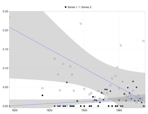
Neat! But the fit lines are a little misleadingly precise. I don’t think we want to say that the “true” value of series 2 in 1820 is exactly 0.15, or that the true values cross in exactly 1872. So let’s add a confidence interval at the usual 95% level:

Better, but this manages to be somehow both too precise and not precise enough. Beyond the line of best fit, which still suggests false precision at the center, the shaded 95% confidence region comes to an abrupt end (too precise) and doesn’t have any internal differentiation (not precise enough). The true value, if we want to think of it that way, isn’t equally likely to fall anywhere within the shaded region; it’s probably somewhere near the middle. But there’s also a smallish chance (5%, to be exact) that it falls outside the shaded region entirely.
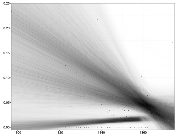
So why not indicate those facts visually, while getting rid of the fit line entirely? Here’s what this might look like:

This seems a lot better. It doesn’t draw your eye misleadingly to the fit line or to the edges of an arbitrarily bounded region, but it does suggest where the real fit might be. And it does that while making plain the fuzziness of the whole business. It would be even better in color, too. I like it. Am I missing something?
On the technical side, this is built up by brute force in R with ggplot. The relevant code is:
library(ggplot2)

se_limit     = 0.99  # Largest standard error level to show; valid range 0 to 1
se_regions   = 100   # Number of regions in uncertainty cloud. 100 is a lot;
                     #   a little slow, but produces very smooth cloud.
se_alpha_max = 0.5   # How dark to make region at center of uncertainty cloud.
                     #   0.5 = 50% grey.
line_type    = 0     # A ggplot2 linetype for fit line; 0 = none, 1 = solid

p = qplot(x, y, data=data)  # Use real data, of course!
for(i in 1:se_regions) { # This loop generates the uncertainty density shading
	p = p + geom_smooth(method = "lm", linetype = line_type, fill = "black", level = i*se_limit/se_regions, alpha = se_alpha_max/(se_regions))
}
p # Show the finished plot
That’s it. As you can see, it’s just brute force building up overlapping alpha layers at different confidence levels. I once looked at the denstrip package, but couldn’t make it do the same thing. But I’m dumb, so …
Update: I knew I couldn’t be the first to have thought of this! Doug Duhaime points me to visually-weighted regression, apparently first suggested by Solomon Hsiang in 2012. There’s R code (but I guess not yet a formal package) to do this at Felix Schönbrodt’s site.
Here’s a version using Felix Schönbrodt’s vwReg(). Not all cleaned up to match the above, but you get the idea:

[1] If you’ve learned any undergrad-level physical chemistry, you can probably see where this idea came from. Here’s a bog-standard textbook visualization of the electron probability density of a 2p atomic orbital:

